
JIRA Enhanced Productivity – Filters, Agile Boards, and Dashboards

Transcript of talk given February 2016 that is published on YouTube:
Introduction: Today we have Michael McNeil from Oasis Digital. They got their start as a development shop who… began to teach people how to use JIRA to do good project management within application development. That led to them being involved as a JIRA Expert or Atlassian Expert. And they now provide classes all around the United States to companies and to organizations for project management training. Today we’re going to talk about enhanced productivity and taking advantage of our filters, Agile Boards, and dashboards to be able to get the information we need out of JIRA. Michael, thank you for joining us. The floor is yours.
Michael: Thanks for having me. I’ll just give a real quick “about me”. He mentioned that I teach on project management and the Atlassian product suite all around the country. I’m spending about five of the next eight weeks out in San Francisco and San Jose working with a number of organizations. And it’s been a pretty interesting transition. I’ve been in project management for over 20 years. I’m getting old. Seeing the transition from traditional project management through the introduction of PMOs, and the convergence then with agile processes, and the developing tension within organizations for agile software teams with more traditional project-management-based reporting.
That’s led to a lot of interesting engagements for us, working with a number of large companies, production teams, engineering teams, to build out environments using primarily the Atlassian product suite. We get involved in the JIRA side of things, plus the continuous integration and deployment side as well.
I run a custom software development company also, Oasis Digital. Mostly these days, we build single page web apps with Node or Java on the back end and Angular. And we’ve even got some Angular 2 projects going right now.
 I also write quite a bit on these topics. I have a blog listed there, mmcneil.com. I also love building furniture. So, if anyone wants to talk woodworking, let me know. I built these [tables and chairs] for my grandkids for Christmas.
Quick agenda: I’m going to give you just a couple-minute version of how to rapidly set up a sandbox on your own. All four of these [topics] are going to kind of be mashed together. We’re going to rotate through a live sandbox environment that I already set up and populated with a bunch of data that we’re going to use to work through filters, some Agile Boards, and dashboards from different perspectives.
Test Environment
Real quickly on rapid test environment setup–Atlassian will allow you to spin up a free Cloud instance without putting in any credit card information or anything. And it can stay alive for a couple of weeks. We use this in our classes. When somebody comes to our class, they’ll spin up their own environment and learn to configure something from scratch.
We also have a free data generating tool that we built that will populate an instance using a JSON file with years of data, user comments, versions, multiple projects, many users. It allows you to, literally within 10 minutes, spin up an instance that looks like it’s been used by a couple of hundred people for six mon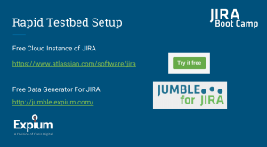 ths, a year, etc. on a bunch of products. That allows you to actually run some of the things that I’m going to show you now against real data. Because if you spin up an empty environment, you can only look at data that has been entered in the system. So, if you’re trying to write a filter, you’re trying to understand and build an Agile Board, if you don’t have anything in the environment, it’s useless.
So, those are the websites for that, and I can provide those later also. But JIRA Jumble is what we built as the free data generator. And then you can get the free instance from Atlassian.
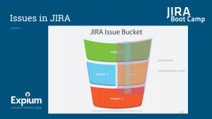
As a foundation stepping forward, it’s important to understand how issues are stored in JIRA. They are not stored in various tables based on projects, or other criteria. Every issue in a JIRA instance is in one big bucket. If you have access as represented by this gray area to three projects — say the entire project here, most of a project here, and part of a project here — you have the ability to slice across this data, across all those projects in whatever way you want. This can be extremely useful, because most people are involved in multiple projects in a JIRA instance.
What I want to do now is jump over to the system that I set up, and I want to start out using this “Search for issues” button. When I click on “Search for issues,” it should show me everything within that grayed out space. I should be able to see, on this list, every issue that I have the rights to see within the system. It doesn’t matter what project it’s on.
If I click down here on Projects, this is populated with what I am able to see. So, I’ve got a whole bunch of projects here that were automatically generated. I can see all the Issue Types represented in all of those projects. I can see all the Statuses from all the various Workflows in these Projects. In this case, they are all the default Workflow. And I can see all of the Assignees.
Say I have a team that is operating, and I’m working with that team of peers or people working under me. Then I can see all of their issues as well.
I start out with this big pile. What people usually don’t understand is that you can create visualizations in JIRA out of the box, very simply, that cut across projects, that compare and contrast two very different things. So, for example, maybe you have a different set of Issue Types on one project than the other. And you maybe have a project tracking kind of item. Maybe one’s in agile, so you’re using Stories on one. And another one, you’re using the New Feature Issue Type to understand what your progress is like on that.
You can sort here by both of those and then have a list of everything from both of those Issue Types and then visualize them together to be able to contrast and see the progress you’re making on both of them at the same time. We’ll show some filters here in a second. This can apply to your personal productivity.
You can have issues that you’re tracking the progress of in your personal boards that span your administrative tasks, your project issues across projects, your emergency issues that might be assigned if you’re a second tier support person on a project, etc.
Filters
That can all be pulled together into the same board. And the process you go through is first you have to filter out exactly what you want. So, I’ve created some filters on the left here. You can see them in my saved filters. So, let’s say I want to look at just a single project. I’m responsible for this project. This one is randomly titled “Absurd notebook.” I’ve got 84 issues in this project. I can scroll down. I can see all the various issues. I can sort them by assigning a reporter, etc. This particular filter I saved previously. But I could also make a slight modification and do a “Save as” here.
One small side note that I’ll make is that it’s usually important for people to share filters with others. Say you want to put something together, you want to share within the team. This [Share] button does not do what you think it does, if you’ve ever tried it. It is not how you share filters. It is a poor choice of UI in many people’s opinions. In order to share a filter on this screen, you have to go into the Details, Edit permissions, and then, through that process, you can Add a Share.
So, I’ve got this filter. I’ve been able to modify it because I can select Issue Type, Statuses, Assignees. I can also go through, and if there are any custom fields, I can search for those.
On this screen, I can also change what’s displayed. Let’s say for the sake of this discussion that the “resolution” field is not important for this screen and that I do want to add the “affects versions” field. I make that change. Now, it has changed the listing on the screen. I can reorder those columns. I can sort by columns. And if I save it at that point, it will remember where I’m at as a user when I come back to it.
This can be very useful because it gives you a quick click. So, I’ve got a whole bunch of filters here, and I can go through, and I can come back to this one as much as I want. And I can click through and I can see my various filterings of those systems. What I’ve set up here is a single project, just my issues (not shown).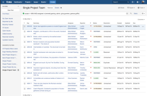
I’ve got a single project for a subset of the team on a project (above). 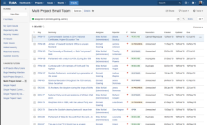
I’ve got a multi-project small team (above). We’ll be talking about these.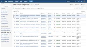
I’ve got multi-project for a single user (above). I’ve got all projects, many users (not shown). And then I’ve got another one that cuts across a little different direction, which is Bugs across any projects that need attention (below). Meaning that they haven’t been touched in a certain period of time.
Going back to the single project, who here has any familiarity with SQL? Well, if you have familiarity with SQL, then you will want to hit the advanced button, and this should start looking familiar. If you click on the “Help” icon over on the right, there are differences between what they refer to as JQL and SQL, but if you click on this icon, this will take you to some pretty extensive documentation that is pretty well maintained. That will tell you about the operators and how to put together some complex examples.
I will go ahead and click on “Bugs needing attention,” because I want to walk through this.
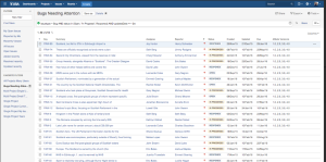
What I’ve done here is I’ve created a query that looks across all my projects. And anything that is assigned the Issue Type of Bug, it’s in a certain set of Statuses, and its Updated Date is older than two weeks. This gives me a subset of items that technically should be given attention.
Participant: How do you know what fields are available in a query?
Michael: It will actually give you a list when you start typing. It will show you all of the fields that are available. But a quick easy understanding is if you go back to Basic and you click on More, it will show you all of the fields here that are available to you. That’s a quick, easy… But as you’re typing, it will actually suggest to you what your operator options are. And if you start typing, for example “A,” it will give you “And” instead of “And” and “Or.”
Participant: One field to always update in my filter is whenever I use a Sprint, I always want to go for the active sprint, and I always have to update it for the active. Is there a way to build a query that always focuses on the active?
Michael: What we tend to do, and this may be something for you guys to consider… Because of some of those limitations, we actually went to our own sprint field. In our teams, we actually have our own field. We got away from using the ones that are built into JIRA.
But I know some limitations here that are frustrating [are] you can’t search effectively and find all issues that are linked. You can’t do a filter for linked issues or for issues that are blocking. You have to use a scripting plugin to do that.
What I’ve got set up here now is a set of filters. As I click through them, you can see there are 200 issues on this. All projects, many users. I have a multi-project, single user. I’ve got 29 issues assigned to me there. I’ve got a small team. There’s 69 issues. I’ve got a single project. There’s 84 issues.
So, I’ve got this main store where I have 1500 issues separated into some bite-sized chunks that matter to me. And that’s the key. If you start here, build chunks that you can actually monitor. Lists of thousands of items cannot be monitored. Even lists over 100 items just cannot be monitored very well.
It’s really important to have some of this data broken down into ways that you can visualize, ways that you can pattern match. So, when I go to the visualizations, when I build dashboards, I’m building things so I can see issues at a glance. I’ll show you some of those and some of those parameters I look for in some of these various gadgets on dashboards and in the Agile Boards, etc.
But if you build filters–and it takes a little tweaking before you get comfortable with it–but once you start getting things into bite-sized chunks, putting them up on boards, you can then have it over in a window, and you glance over at it every once in a while, and you can see something that’s important. You can remind yourself of what’s important, help yourself stay on task, etc.
We use it extensively within our organization and a lot of our customers do as well. I’m going to start with Agile Boards, and then I’m going to go to dashboards from there.
Agile Boards
Agile Boards are driven from a Filter. If you assign it to a Project, it’s a project-based filter. If you assign it to one of your own filters, then it’s driven there. And you have control over a lot of parameters of how this is displayed.
Now, you have to understand: if the filter is shared with somebody, that person can also see your Agile Board. So, if you want an Agile Board that you’re going to create in a certain way, and you’re going to use terminology that you don’t want everybody to see, find the filter that interests you, make a copy of it, and then make your board from the copy so that the sharing is not automatically connected.
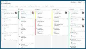
A couple of versions ago, they didn’t have that linked, but now an Agile Board is automatically shared with anybody that can see the filter. In this environment, this is a Kanban board. It’s a style board that is very configurable, but it does have a couple of key limitations in Atlassian’s implementation of it.
The first one is that the columns are organized by statuses. So, everybody here is familiar with the Workflow, right? You’ve got your Workflow. It might have 12 statuses in it. If I have 12 statuses, I choose which column each status is going to be represented by. It’s typically a good practice to go left to right, unless you’re in another part of the world where you want to go right to left. You can do it either way. But you typically go left to right, and it’s the beginning of the life of a particular issue to the end of a life of an issue at the end. We have the ability to configure that.
I’m going to run through these all individually, but we have the statuses and the columns; you’ve got the ability to do swim lanes; you can control what goes on the issue cards; you can control some quick links at the top. Like here, for example, I’m on a single project board, but I want to sub-filter to just my issues. I want to see the ones that I’ve also recently updated. So, maybe I want to see the ones that the team has recently updated. Well, I’m the only one that has updated something, so…
But you can set these up. And so all of these things are configurable, even colors on the cards, as I’ll show you in a minute. These can all be done via queries. What I was just showing you with the advanced filtering applies to configuration of these boards as well.
When I go into the settings here, I can see my filter query right here. I can select the different one if I want to use it. And I can change the board name, etc. And then you can also affect the sharing of the filter from here. So, you don’t have to go back and find the filter and share it, it will click you through right here.
What’s important here is… We’ll go to the columns. (I’m going to pass on the column constraints, because most people don’t use that feature.) But this is where you select. It’s drag and drop. You can add more columns, etc. You can add as many as you want. And you can drag things around, and you can make this pretty explicit. I’m going to go ahead and delete these and leave the three I’ve got.
But this is where you can drag and move around. If I wanted “Resolved” to still be considered in progress because we’re doing a validation process, so it’s not really done until it’s actually in production, I could move that back to this column so that I could see that that’s part of my work that still needs to be done.
Swimlanes. This is where it gets interesting.
Participant: Can you explain the “Days in column”?
Michael: This checkbox right here…this is an old, original feature. People either love it or hate it. But it gives you this little dot indicator at the bottom of the card. And essentially, if something has been sitting in that status for a long time, it has more dots. It doesn’t give you any real data; it just gives you an indicator.
This item was moved. I’m going to go ahead and move this guy over here. I’m going to go ahead and start progress. Now it doesn’t have dots anymore, because it’s brand new in this status. These, according to the system I imported, have been sitting in this status for some time. And it does vary how many dot move across there. That is the setting we were just looking at, which is the Days in column.
Looking at swimlanes, you can automatically base swimlanes on assignees, on stories, epics, or on queries. They added this ability for queries to specifically allow you to essentially do almost anything with it. So, these can be very complex.
Typically, people will automatically make all of the swimlanes related to each other. That’s not necessarily the way it needs to happen. You might have some tasks on a certain project that might be in an expedite row or some separate type of tracking mechanism. You can do that.
For example, on this board, I have everything related to my team. I’m saying it’s a Hardware team. (This is bogus because it was just bogus data that came in. If anybody knows what DevX is, I’m really sorry.) but then I’ve also got an Expedite swimlane. So, when I go back to my board, I’ve got everything associated with hardware in this swimlane here. I’ve got everything that’s a major priority here. And then everything else is down below. So, it’s a quick organizing mechanism for that. It doesn’t have to be used for stories. It doesn’t have to be used for sprints. It doesn’t have to be used for features. It can be used for anything you want, in essence.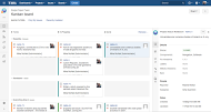
If something shows up in multiple queries… Let’s say you’ve got multiple queries going on in swimlanes, it will show up in the top swimlane. It will not show up in the additional swim lanes. It shows up in the top one first, so that is a quirk that can catch people out at times, trying to use this for very complex things.
I know they’re working on a board specifically designed for JIRA Core, which is more business-centric, that will have a lot more capabilities related to the configurability, and won’t have some of the restrictions that are tied to its software development origins. That will even allow us to do more with the board when that gets released this year.
Participant: Can you explain that from this link over there? You may have alluded to it. Can you explain what it does?
Michael: If everything is set up properly, when I release this, I should be able to put in a version, and that will create an ad hoc version and it should — and it didn’t on this because it it’s not configured right. On all of our boards, it removes it off the board.
Participant: Just the things that are done?
Michael: Yeah. It takes anything that’s in a particular status, resolves it, and drops it off the board in our setups. This one isn’t set up to do that. And that’s a good way to use it. Is that how you guys are set up? Do they drop off the board when you resolve them, when you release them? That’s how it should operate. I set this up in an airport, in LAX. So, forgive me. It’s not completely configured yet.
A couple other important aspects that you can configure is these quick filters that go on the top. Those are query-based, so those can be anything that you want. I’ll show you some examples of some more interesting ones in a little bit.
You can change the card colors. In this case, maybe we’ll do colors based on Issue Types. I can select my colors. I can do the normal color picker. Now, when I go back to the board, based on issues types, there’s a small swatch of color on the left. It used to make the whole card ugly. Now they’ve made it a little more subtle with their styling design. It’s a lot more usable. But we actually use color for a specific purpose on one of our most important boards in the organization, which is tracking all of our training classes.
Going back to the board, I can configure those card colors. We’re going to look at quick filters a little bit more. I can also specifically add any of my custom fields to the card. So, maybe I care who the creator was. I’ll add that. I can add up to three fields. They used to have it unlimited, and you’d be able to make cards that are about that tall. It’s kind of silly. They’ve restricted it nicely at this point.
So, if I go back to the cards now, on each of these, it’ll show who is creating the issues. So, I created all of these issues because I imported the JSON file.
Participant: [Can you add] priority?
Michael: Yeah. Priority is already on here. That’s the arrows. But you can also put the written form in there as well, if you wanted it. Any of your custom fields, any of the standard fields are pretty much available to you.
You’ve also got a whole other view here. Let me show this to you. When you click on an item–many of you that have used these will already know this. Our guys tend to use this as their primary point of reference for a project–When you click on the item, it will bring up the separate pane. You can control what fields are displayed there as well by modifying the issue detail view.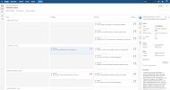
This is the only screen that is editable by somebody without admin rights. Although you can configure the edit screen, this is the one that you can get to that you can actually change your interface with very easily. So, if I go back over here, I go to issue detail view. I can see all the fields. I can reorder them. If I want, I can add more date fields, more people fields, linked issues. Any of my custom fields are available to me, everything.
Participant: Is there any way without using a release to filter the completed issues off the board?
Michael: Yeah. Absolutely. That’s actually a pretty common use. You can have your main filter bring a pile of issues in. And then under the general selection here at the bottom, you can add a sub-filter here. So, you can filter things out. Here’s what’s important about that: curating saved filters on a system can become an issue when you have thousands of users. If every user has 25 filters, and you have a thousand users, that’s 25,000 filters. And then, if the staff turns over at a rate of 10% per year, think about what’s being left behind over the years based on all those users. So, if a hundred users are leaving behind 25 filters each every year, that can make a mess.
What you can do here is you can have a general filter that takes it down to a list of issues. Then say you’re building Agile Boards for a team of 12. You could have the main filter capture all 12, and then you could make copies of the same board and then sub-filter to each individual user. So, you’ve been able to spawn 12 boards from a single filter instead of making 12 filters.
So, there’s some best practices that you can apply here to improve the situation for the admin side of the organization. [Similar to] when you add too many custom fields, if you have too many filters, it does slow a system down.
Participant: We do already have thousands of filters. It’s ridiculous.
Michael: I know organizations where they have somebody almost full-time maintaining all the shared filters and everything, because they have so many. And they’re just constantly going through, looking for duplicates and deleting just to keep the system optimized. But that’s for an enormous system with millions of issues in it.
I want to look at a few of these [sample] boards. We’ve looked at a single project board, so on this project I can see the various issues. There’s only a couple of us working on this board. I can see the progress. I’ve got these expedited issues at the top. I can see what’s a particular component, and then if I want to just monitor what’s going on with the rest of the project, I can.
I can switch gears, and if I go to my view of the world, across multiple projects, then I can see just a flat view, what I’m working on across all these projects, what I’ve accomplished. In this case, they still haven’t dropped off the board. And I can prioritize my work. If I saw this on one of our guy’s boards, I would say, “You’re not managing your work very well. You shouldn’t have more than four or five issues in progress at any one time. Otherwise, you’re never going to get anything done, or one of them is going to sit there for weeks and you’re never going to crank through it.” I’m breaking my own rule here. I’ve got 10 in progress, and 9 waiting to be done. But I can see this across everything that I’m assigned items on. This is across all projects.
I also have a board I set up for the issue of something that’s time critical. On this board, I’ve set it up to where these are all the Bugs that haven’t been touched in the last two weeks. They’re going to be user-reported issues or customer-reported issues or issues found in development. And I can see this board by individual. And I’ve got a separate column here that’s a little bit different. It’s what’s recurring versus what’s just in to-do and in progress. And here, I don’t even have the resolved and done showing up on this.
What I care about on this board is what’s new that’s come in, what’s being worked on currently, and what keeps coming up. If it keeps coming up, why haven’t we solved it? Maybe it’s something that recurs version to version because somebody keeps making the same mistake in their approach to a problem.
So, I can see by person who is assigned to what, what progress they’re in, and I can just monitor this progress. So, I might have something like this up in a tab on a window on the side. I just look at it day to day and see where things are. Every time the browser refreshes, it will update or you’ll get a little notification in the lower right saying, “The board has been updated”. Click the button.
All of that I’m going to talk about when we get to dashboards, because that’s all oriented around keeping the load on the system reasonable.
Participant: It seems like you could have accomplished the same end that you’re doing with swimlanes with sub-filters. And it’s just a matter of “to-may-to” “to-mah-to” of how you want to slice and dice this.
Michael: What I do is, if I can sort it by status, I put it in columns. I don’t waste my swimlanes on status, because I’m forced to use status for my columns. It’s all I can do to organize.
Participant: I was talking more about the sub-filters. You could have had each person’s name as a… quick filter.
Michael: Oh, in a quick filter. There’s a reason why I didn’t do it in this case. And that’s because there’s so many of them. I would have ended up with too many to go across. It would start to take up screen real estate. So, there are different approaches. But, yes, you could have added them to the quick filters up top. And the recently updated, obviously it doesn’t apply to this. I don’t have a good quick filter set up for this one, because the only reason they’re on this board is because they haven’t been recently updated.
Participant: On the quick filters topic, we do have a lot of quick filters. JIRA does restrict it to just two lines, and then it’s click a link to show more, then it will expand it and show less and collapse it.
Michael: The other aspect of the quick filters that does apply is they are toggles, and they can be cascaded. I’ll show you on our training board. You can sort by type of class and then whether it’s public or private. If I set it up in a certain way, I could set it up by what city. And you can cascade that filtering to take your board and shrink it down to a small list.
That’s this board. Let me go back over here. I want to talk about this since we’re on boards before we go to dashboards.
This is a copy of our training board. I can’t bring up our production system. We’ve got too many NDAs in place with too many various companies. But this is a dummy training board which mimics our normal tracking board for our training projects.
I want to bring this up because you can see across the top I have a regular set of quick filters. I can sort it by public or private, and these are all cascading. And they are all very useful to our team.
Then we use the quick visual of color here to indicate how firm a date is. So, if a date has just been offered, then it’s red. If it’s been penciled in and held, then it’s yellow. If it’s confirmed and it’s hard on the calendar, then it’s green. So, we have about nine instructors right now that are teaching classes and a few other people that are secondary instructors on classes. So, they can go to this board. They can filter it for their classes, and then they can see real quickly what they need to book travel for, where’s the class, what are they doing. They don’t have to talk to anybody. They don’t have to do anything. And everybody shares this same board.
They can also see what kind of companies are rolling through the process of being talked to, inquiring of us. We don’t have any outbound sales. Everybody is calling us. It’s a very pleasant position to be in. And so, we’re talking to these companies; we’re navigating through our schedule, what their needs are, are we a good fit?, do we have the instructor available in the timeline they want?, all those things.
And you can see these starting to emerge. So, we might assign them to an instructor based on a particular industry that the customer is in or the makeup of the development team. We do development-based classes as well as the project management and JIRA classes. We might take a look at what their particular environment is. If they’re coming from a .net perspective versus a java perspective, I’ll have different instructors work with the teams, depending on what type of problem they’re trying to solve as an organization. So then they can see what’s coming.
There’s value here in communicating the future, not just communicating the progress. You can take a look at your boards, and sometimes there’s value for you to know what’s on the horizon. A good example is, if you’re in an engineering team, and something has been proposed by somebody in management as a possible new initiative to develop a whole new aspect of something. Then it’s good to know that that’s out there in the being approved process. And you can monitor that on the board, along with your regular work, because it could potentially have a big impact on your team. And it might cause you to reshuffle priorities within your team or within your workload to be ready for that when it comes. So you know what’s coming in the future along with your work and the progress going by.
That’s a real asset to these Agile Boards, because you’ve got the flexibility in the filters. You can have those two lists come together in the same one. You can display disparate issues types from different projects. And you can see them kind of on a different axis. You can see if it’s going to be real or not versus what part of the Workflow is this in, and how done is the item. Does that make sense?
Dashboards
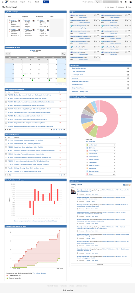 I’ve built two dashboards here from two different perspectives. The first one is from my perspective. There’s typically 40 to 50 gadgets available to folks when they build a dashboard. One of the most important ones is [that] you can take that Agile Board that we just did, and you can put it in a gadget on a dashboard. So, that same Agile Board–it’s not as clickable as the other one–but that same Agile Board is available to be displayed for view purposes on this [dash]board.
Also on this dashboard, I’ve got a calendar showing issues and their due dates, showing versions. I just released this version today. That’s the one I just made. If I click over into March, I see I have some due dates on some other items here. I can see this on a calendar basis.
I can also see issues that are assigned to me across all the projects. I have customized which columns show on this particular filter list. You can select that. And all of these are based on individual filters. I can see right here “Single project, my issues”, that’s the single-project-my-issues filter. If I go in and edit it, I can select a different filter, and I can go see all my filters that I’ve made, and I can change how these are configured.
I can have two of the same gadget next to each other on the same dashboard showing two different filtered lists, which is great for comparison purposes.
As I roll down through here, I can see “Assigned to me”. On my board, I can see what percentage of the issues across all the projects I’m involved in are assigned to me. Am I getting too much of the load? Am I not getting enough of the load? You can start to see that, and see that relative to others.
Another important aspect of all of these gadgets is I can click into them. These are live. So, I can click into this and go straight in, and it will take me directly to the issue list. If it’s another type of gadget where there are individual issues represented, if I click on it, it will take me directly to the issue page. For example, this will take me directly into the issue view.
I might have my favorite filters here. So, if I want to be able to have quick access, it tells me how many issues are filtered with that filter right here. An important one that people overlook is, say I’m involved in a bunch of projects. I could have all of those projects listed here, and there’s about three levels of detail that can be selected.
But here’s what’s very valuable: I can go in on any project, and I can go click the calendar, and I can see when all the issues are due on that project. So, I can click through, and I can see that. And I can also go through here, and I can see some specific sub-filters of that project with one click. And some of them are quite useful.
If you’re in software development, you should know what this is: the Created-Resolved chart.
I find this extremely useful because it shows me the created issues, and the number of them, versus the resolved issues. And I can see here on this project, the team was falling way behind. I added some more resources to the project, or people got in gear and figured out what they were doing. Now, all of sudden, we’re keeping up.
I’ve have lots of examples of this that I go over in the classes where we’ve got some longstanding, 10+ year projects. You can see over time when the project has been in trouble, when there’s been too many people on the team and we start to catch up. You can see that develop over time. You can also see what a greenfield project looks like. It will start out with nothing, and then it will shoot into action. And then it will go into more of an operating and maintenance mode. It’s kind of an interesting exercise to look at 20 different projects and see their shape and how they come together.
This is “time to first response”. I’ve [also] got an “activity stream”.
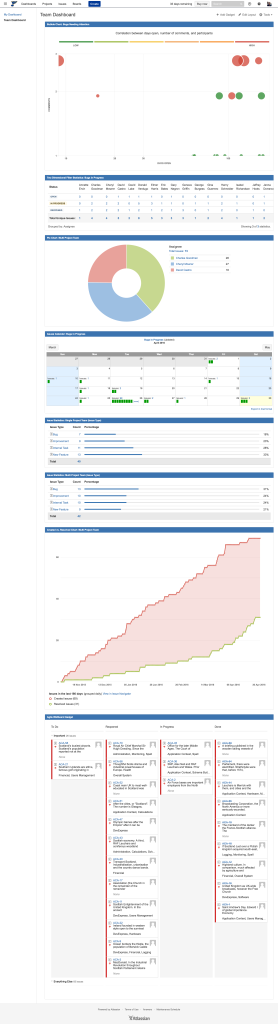 The other one I want to show real quick before everybody has to walk out of here is a dashboard related to a team. There are some interesting aspects to this. This first one is a bubble chart. This shows data across multiple axes at the same time. But essentially what I can see from looking at this, this is my “Bugs needing attention”. I can see that the important ones are red. The size of the dot is how much activity there is on the item. So, these ones at the bottom… I see we’re doing a good job because they’re all green. It’s not really much of a surprise that the most important ones are the ones that are taking us the longest to get solved.
I can see that up, and to the right, I’ve got some unhappy stuff happening here. I could actually click in and see the issue and look at it. This has some interesting uses. I can also do 2-dimensional filtered statistics. Here, I’m looking at my particular Assignees and the progress of their Bugs all on the table. So, I can choose my columns and data that I want to show.
Here’s a pie chart again by Assignment, a calendar for all of the teams and all of the projects, and I can click in, and I can see each one.
I often use this. I’ll create a calendar for recently updated items. So then I can see on the calendar what items were worked on what day–not so I can harass the guys, but so that when a client is calling or saying, “Why isn’t this getting done?” I can look and see the reason it’s not getting done is because nobody is working on it. If nobody is updating it, if nobody has committed any code, and nobody’s made any comments, then we’re not even looking at the thing. So it’s a quick access for that.
For various statistics here, I’m comparing the same filter, a single project compared to all projects. I can see that I have 28% Bugs on my project, and across all projects, the average is 25%. So, you can see differences between how one project is performing versus a bunch of others.
That same chart again… Other pretty basic stuff, and then I might have another agile wallboard showing at the end. Any other questions on dashboards real quick? I know I blasted through those really fast.
Participant: How did you explain what the balls are here?
Michael: The bubble chart? This one takes a little bit of time to grasp. The axis over here is comments. The axis here is how many days they are open. And size of the bubble is related to the activity, and the color of the bubble is related to the priority. So, if it’s red and big, that means there’s a lot going on. If it’s green and small, that means it’s unimportant and nothing has been happening to it.
Participant: Can you quickly show how to share a dashboard?
Michael: Yes. Important note. If you’re going to share a dashboard, every filter on the dashboard also has to be shared. But you can share the dashboard under Tools > Share. But then any filter that you’re using on that dashboard also needs to be shared or they’re going to get an error on that particular gadget.
Participant: How would people go about finding shared dashboards?
Michael: You can go to Dashboards > Manage dashboards, it will show you a list here. It only shows you your favorites, but if you leave it empty and search, it will show you all the dashboards in the system.
Participant: When would you use a dashboard versus a page in Confluence?
Michael: Good question. I would use a dashboard for data that was specifically going to be used internal to the teams. And if there was any chance of it needing to go outside of the organization, I would put it on a Confluence band.