
Comparison of new (Cloud) view screen and classic view screen
 view screen and classic view screen")
Last year Atlassian released a trial version of a new Issue View Screen in the Cloud version of Jira. This blog will walk through the differences between the old and new version.
Note: This new View Screen can be turned off by selecting the “Turn off new issue view” link under the ellipses. Selecting this link will take the user to their profile where they must turn off a toggle switch called “Jira labs.”
You are probably very familiar with the old version of the Jira View screen which looks like this…
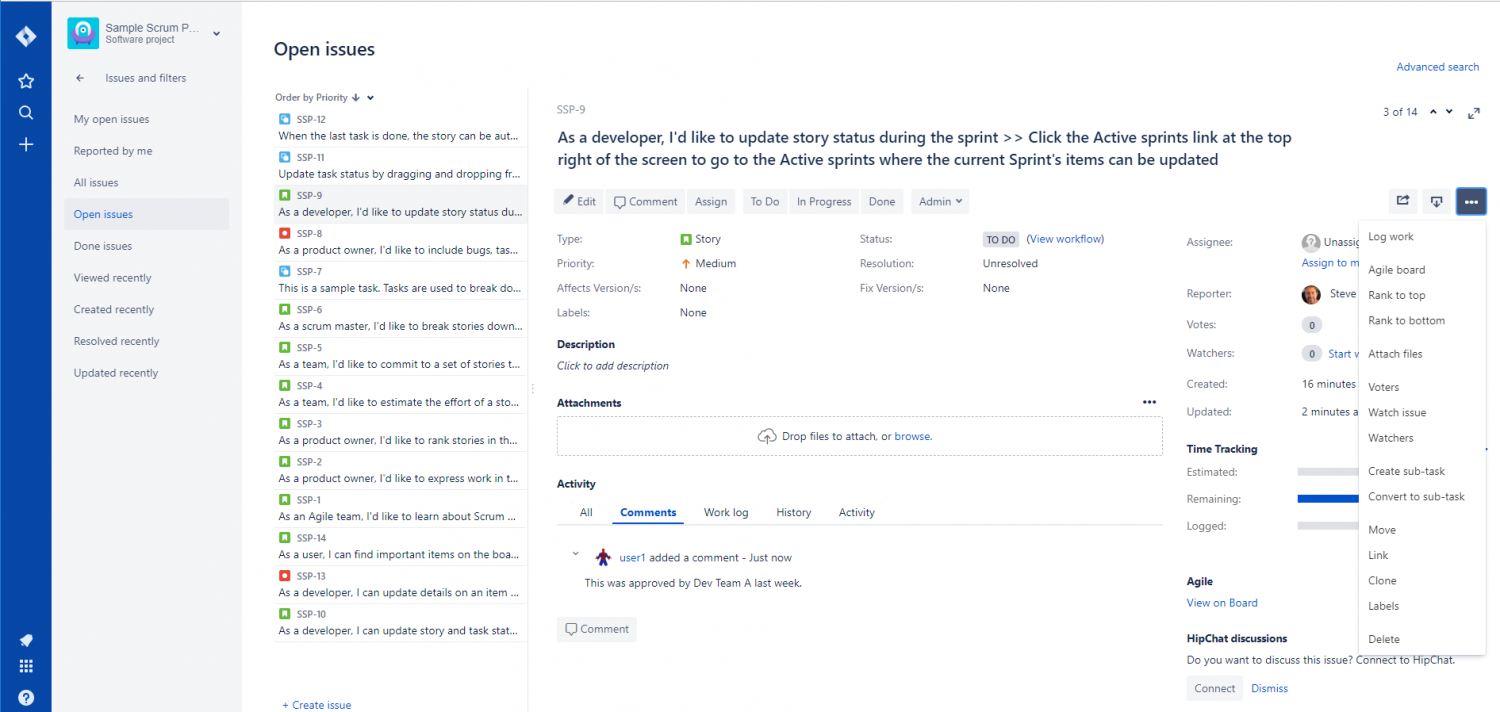
Key Features include
- Separate Edit and View Screens
- Field layout across the entire View Screen (many Fields are filling screen real estate)
- Field layout organized by category (People, Time, Log, and Data sections)
The new Jira View screen has changed both the view and functionality significantly
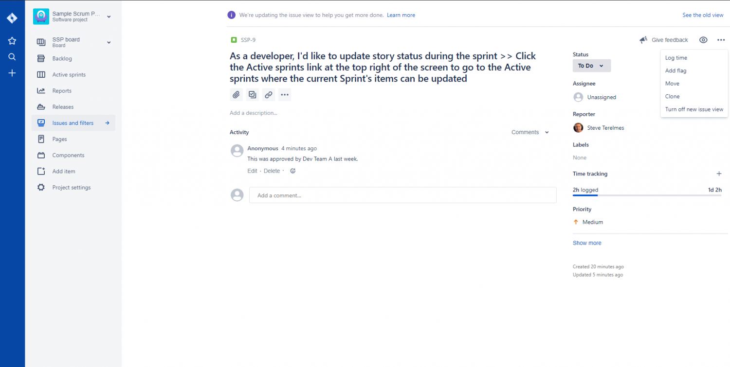
Obviously, logs and content fields have taken a dominant position in this new View Screen, not only claiming most of the screen but also being put right in the center while all other fields are pushed to the far left.
Along with the obvious changes to the screen layout, there are several other more subtle changes that are compared below.
Log Features (including Comments, Work log, History & Activity)
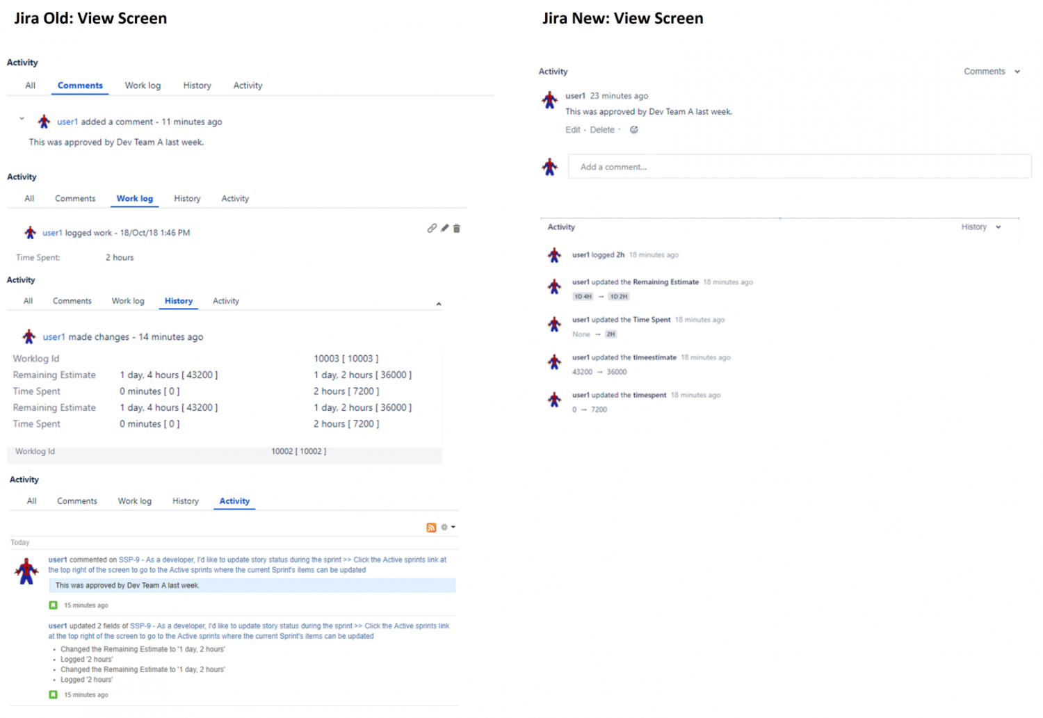
While the Comments log does not appear to have changed much, the new View Screen has an option called History which appears to combine Work Log, History, and Activity all into one blog called History.
Transition and Statuses
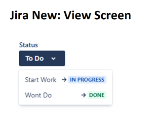
Perhaps one of the biggest changes is that the new View Screen does not include transition buttons. This helpful new feature allows the user to see both the transition and the following status. The old View Screen only allowed the user to see the transition buttons.
However, the old View Screen also had a link available for the user to view the entire workflow diagram. This link does not seem to exist anymore on the new View Screen.
Field Locations
In the new View Screen four main Field locations have been left in the center. These are Summary, Attachment, Subtask Creation, and Linking. All other fields have been moved to the far right where they are stacked in a single column.
The fields stacked on the right are not categorized into sections (obviously because they are all limited to one column) making it more difficult to quickly spot data any one particular field. Also as you can imagine, loading all the fields into one column on the right side requires the user to both expand (using the “show more” link) and scroll to see many of the fields.
As a result, if users are dependent on non-content fields, they may wish to switch back to the classic view to avoid needing to scroll a lot to see those fields.
No Edit Screen
The new View Screen eliminates the Edit screen altogether by including all the fields along the right side of the View Screen. This may remove redundancy and therefore, be considered an improvement. But by removing the Edit screen Jira has eliminated two very important features available to users and admins.
First, there may be good reasons for both users and admins to want to have the View and Edit screen actually show different fields. One reason is because the old View Screen only shows fields that have been added to that screen AND have data. By doing this the old View Screen is able to keep the View Screen clean and simple. Also, in the old View Screen and Edit Screen Admins can choose to display a different selection of fields if the needs of the project requires this. An example of this would be if a project would like to see all the fields on the Edit Screen but a limited set of fields on the View Screen to keep the View Screen clean.
Second, the old View Screen holds a very important option at the top of all three Issue Operation Screens (Create, Edit, & View). There is a button called “Where’s my field?” This button allows users to customize what fields they want to see separately for all three of these screens. The new View Screen does not seem to have this feature. This not only limits the user’s ability to configure his screen’s fields, it also requires the user to see all fields the Admin might indiscriminately place on the screen. By removing this option the user may find themselves scrolling all around the right side of the screen looking for the one field he frequently needs to populate.
Other Changes
Several other smaller changes result from the new View Screen. Here is a list of many items that existed on the old View Screen but seem to be missing on the new one.
- The Issue number (i.e. 1 of 14) is missing
- The Share (via email) and export buttons are missing
- Agile board and ranking options are missing
- The concept of Voting and Watching Voters is gone completely
- The Resolution field does not show up until the issue is resolved
There is also a new ellipsis button under the summary in the new View Screen. When pressed the user is presented with a large “+ Add more” button. This would imply the ability to add additional fields under the summary (like, perhaps, the ones identified as missing in the paragraph above). However, clicking this button only brings the user to the Atlassian Marketplace.
Conclusion
In conclusion, the differences between these two view screens will impact people differently depending on their needs. If projects are data-heavy, the new view screen will be challenging, requiring the user to scroll frequently to view or add data into fields. However, if a users project is data light, but often requires a lot of description or numerous comments in its lifecycle, the new view screen may prove to be valuable.