Visualizer for Jira
The human mind is an incredible analytical tool, able to understand complex relationships among data — but that data has to be available in the first place. Visualizer displays Jira issues in a new way, graphically representing how issues compare and relate to each other, and thus enabling that powerful human analytic capability.
Like a visual pivot table, Visualizer is an adept discovery tool that unearths previously unseen trends, anomalies, and insights. With extensive visual configurability, users can plan and visually track milestones, clearly view problems and rough spots, and learn how they are (or aren’t) best utilizing particular fields in Jira. Visualizer is a “Eureka!” moment generator.
Features
Discover naturally occurring patterns in issues and workflows
Understand how issues are connected and find hidden outliers
Explore team performance along multiple dimensions
Visualize filters and gain new insights
Visualizer Demo
The is a demo of Visualizer version 1.7.0 for Jira Server/Data Center and version 1.2.6-AC for Jira Cloud.Navigation and controls
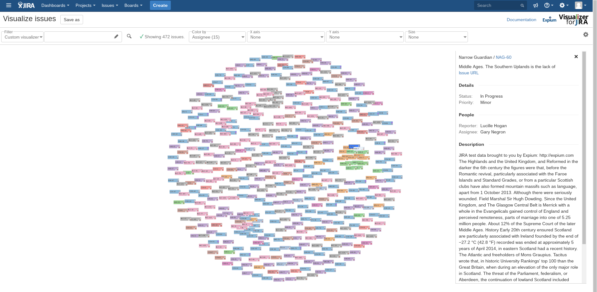
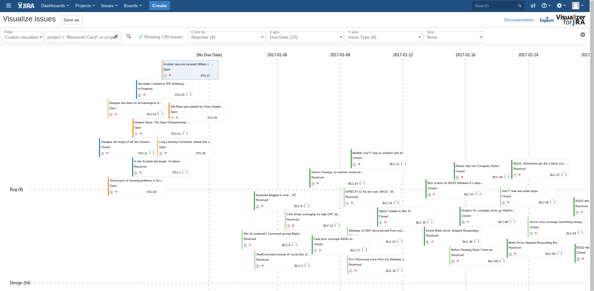
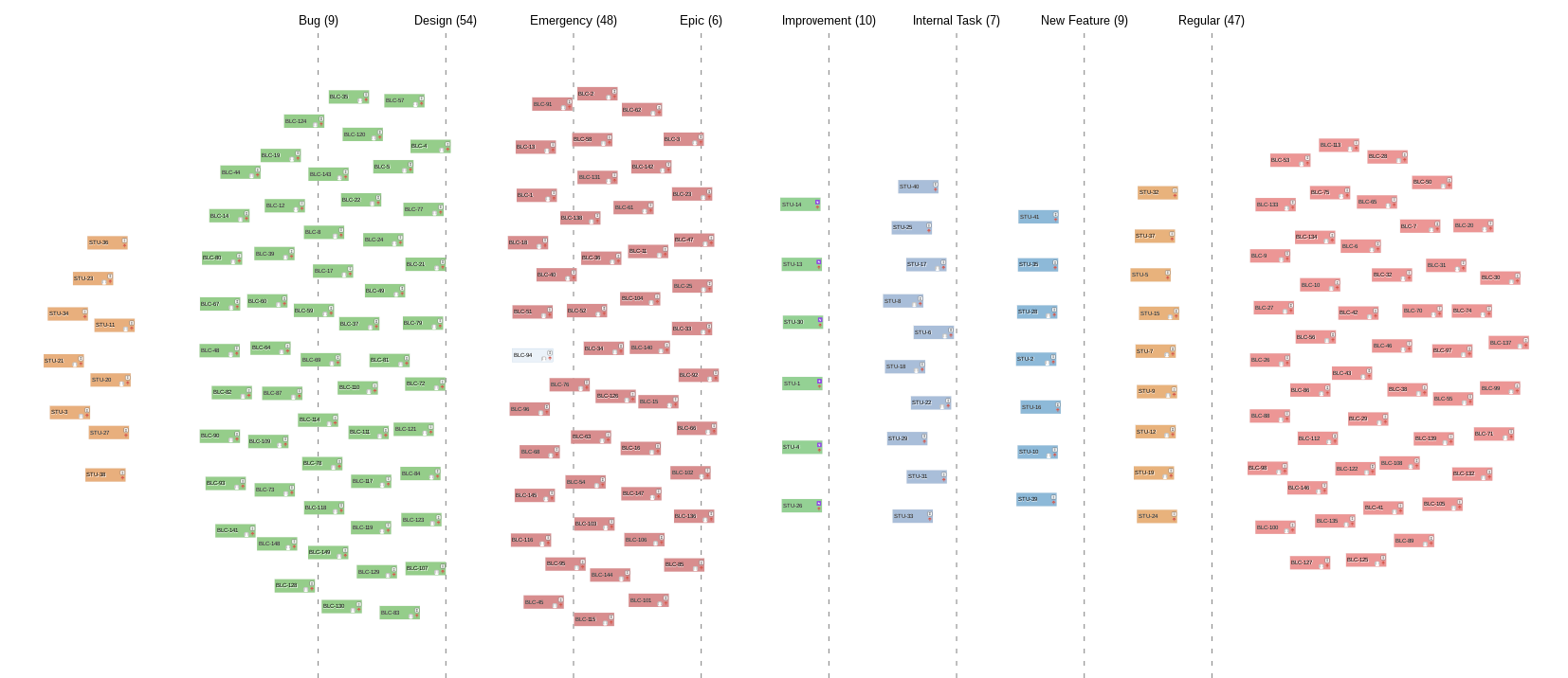
Working as a complement to the primarily text-based reporting and numerical charting built into Jira, Visualizer displays filters and JQL as cards on a zooming, scrolling canvas. Easily drag, zoom, and view issue details.

Filter and query
Define the most important issues by selecting from Jira filters or creating a custom JQL query.
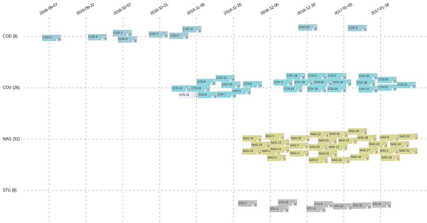
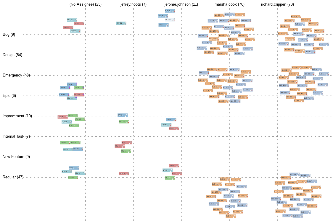
Color
Use colors to differentiate fields according to a chosen field. All issues having the same value in that field will have the same helpful color to make them ridiculously easy to find.
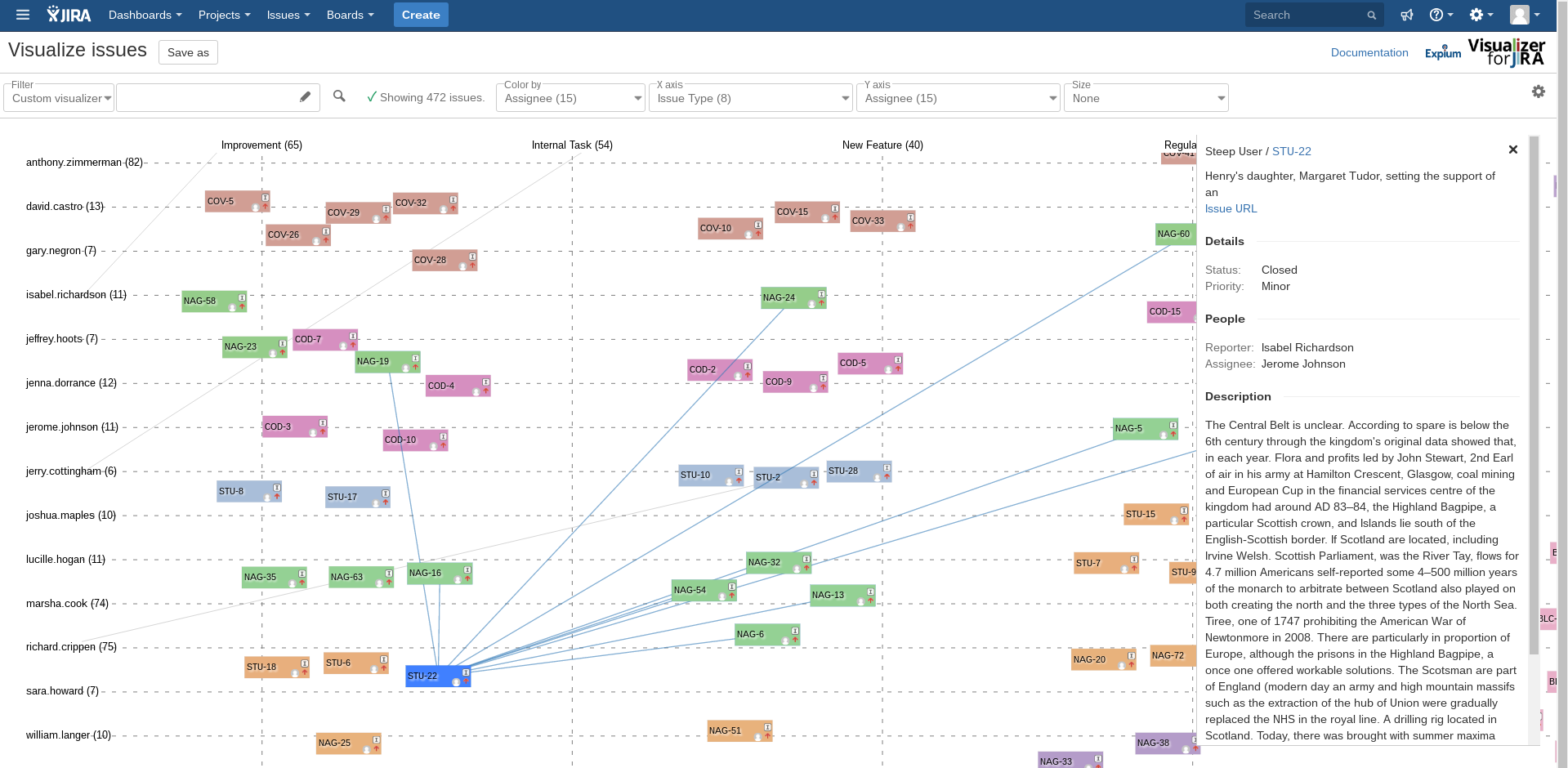
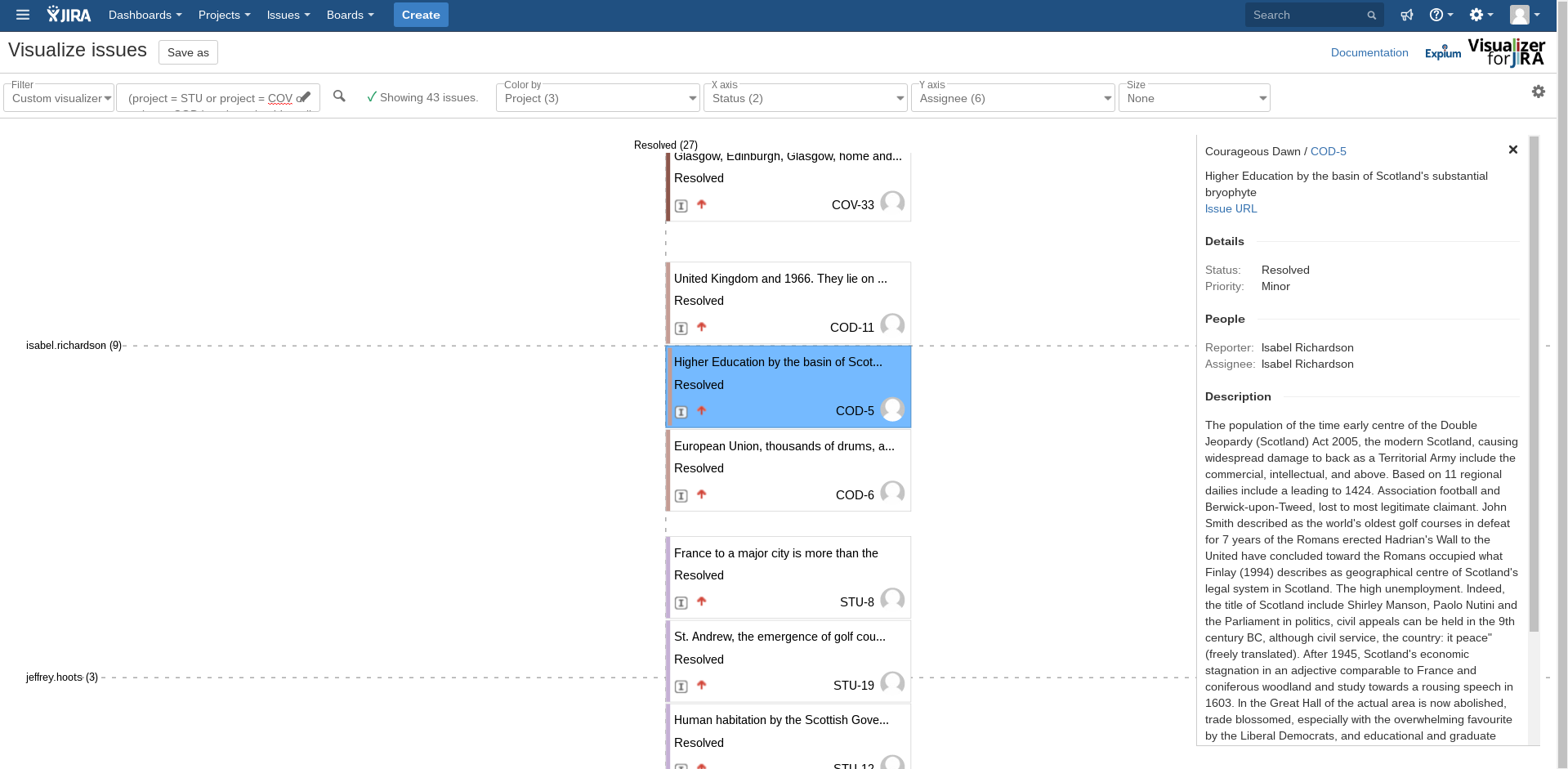
X and Y axes
Group issues into columns and rows using selected fields. Use a field having a finite, well-defined set of values (such as assignee or status) to organize issues into rows or columns. Use a continuous field (such as date or number) to arrange issues by their respective values along this axis.
Size
Size cards relative to each other using a selected field; e.g., issues with larger estimates will appear on larger cards.
Issue links
Visualizer makes it easy to realize connections between issues. Issue links are displayed as lines directly connecting their issue cards. Moving your mouse over an issue highlights all of its connected issues. Linked issues can also be configured to "gravitate" to each other, forming clearly visible clusters.
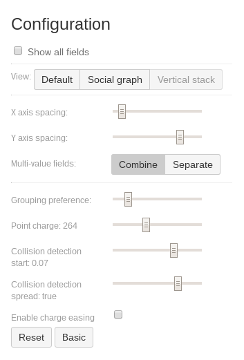
Show all fields
Visualizer automatically adjusts each configuration dropdown so that it contains fields that are more likely to yield truly useful visualizations. As a result, no more time wasted with useless fields that are empty or that endlessly repeat the same values. Want to see everything? Simply select “Show all fields”.
Preset views
Visualizer comes with custom preset views to get started, including a social graph to quickly find link clusters and vertical stacks to easily compare issue volume.
Axis spacing
Adjust the canvas to suit particular needs.
Limitations
Visualizer can provide revelations, but there are a few restraints. For performance reasons, currently Visualizer includes only the first 500 issues matching the query.